Angus went away and made a few logo's for the film opening, consisting of a few similar designs - most of which having a black, opaque background. Here is the first logo:
This logo has a professional feel to it, with the ace shape in the centre making the whole logo has a professional film feel. the 'Midnight Pictures' around the outside give the imaginary company a name which seems daunting possibly fitting with the genre of the films being made by it. The 'Titan-Mind' at the bottom indicates the company in a subsidiary, meaning the idea of the company is more realistic.
This logo also fits in with the action/thriller genre with the black background and the red (signifying danger) writing. The 'Red-X-Scar' seems to make the logo more vicious and sinister, again fitting in with the genre of the films.
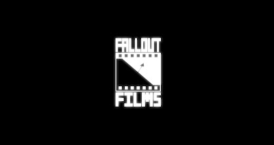
The final logo that Angus made is that of 'Fallout Films', this logo has a white glow about the main section and a simple arrow logo in the centre. The idea of the logo is that the glow is residue from a nuclear fallout which, again, fits with the whole action genre.
So all in all the logo's seem professional and would be suitable for a real film, never mind an armature film. Most of the logo's will probably be used as all give a certain feel for the film as well as just looking good.


No comments:
Post a Comment