The first logo I looked at was Paramount Pictures. Their logo consists of a mountain scenery with the name of the company above the peak. The text of the company is stylish yet professional, suggesting the company is sophisticated. As well as this the stars that form a circle between the mountain an the text makes the logo stand out more. The stars obviously resembling class and superiority, but all together the logo looks impressive and would open into a great film. The logo is pictured below:
The second logo I decided to look at was that of Warner Brothers. This logo seemed more relaxed that the Paramount logo, possibly because Warner Bros. films are aimed at a younger audience that that of Paramount. Anyway the logo consists of a gold shield shape, signifying the brilliance of the company as well as having a common logo that people could familiarise with. The WB in the logo obviously indicate Warner Brothers but the letters stand out as they are curved, suggesting a friendly feel on the whole thing. Ultimately the logo seems to be aimed at a younger audience but still looks like the film following the logo would be good! See logo below:
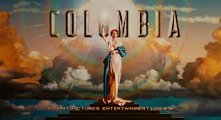
After looking at three logo's from similar companies i have learnt that the logo's we make will need to look professional yet powerful, as well as this the aspect of clouds seems to be present in all three. This is an idea we could possibly use for our logo's.


No comments:
Post a Comment